Anyway, I like our coins, but we keep messing with them, and not for the better.
Take the penny. The back has undergone some changes recently.
What on earth is going on here? The face is fine. Fun fact I learned from Who Wants to be a Millionaire, of the penny, nickle, dime, and quarter, only the penny has the president looking to the right. But the backs? The wheat penny, nothing exciting there. When I was a kid, I thought it was a weak penny. I didn't understand it. Still exciting to find in your change though. Lincoln memorial? Now that was good. The cabin? Sure, whatever. Lincoln on a log? Looks like he is going to the bathroom. Who knows what he is even standing in front of in one of them. The half done capital? Celebrate incompleteness? No thanks. The new design with the shield? Atrocious.
Our penny has gone from good with the Lincoln Memorial to bad with the shield.
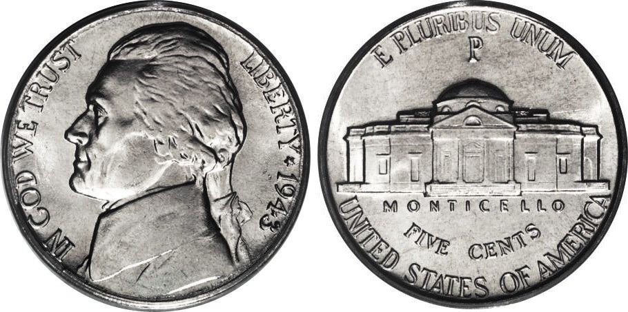
The nickle.
The Buffalo Nickle. WOW. Probable the MOST AMERICAN COIN EVER. You don't get much better than that.
So of course we changed it.
Not too bad. It isn't the Buffalo Nickle, but not embarrassing.
So of course we changed it. The cause was good, the 200th anniversary of the Lewis and Clark expedition.
The first change with the backs. Nothing too exciting.
The second change included the front. Jefferson is oddly off on the side with a weird close shot. The "liberty" in his own writing is cool. The backs, we brought the buffalo back! But only for half the coins in a year.
The third change. What have we done? Back to the old reverse, but the front... He's oddly staring at me.
That's just creepy.
The dime.
If any coin needed to be redesigned recently, it was the dime. President Roosevelt is fine, he can stay. Even though he has been beheaded compared to Jefferson and Lincoln. But the back? What on earth is this nonsense? As a kid, I thought it was a forest. Now I know it isn't, but still. E pluribus unum is oddly broken apart. Eplu Rib Usu Num. Still sounds Latin though. A random torch is floating between a oak branch and olive branch. Fix this gibberish!
A new back for the dime should reflect something about Roosevelt. I think the flag raising over Iwo Jima would be perfect.
The quarter.
The front is fine.
We use to have George Washington. He looked like this.
We still have George Washington, but made him look a little nicer and moved some things from the back to the front.
The back use to be the Eagle.
Nothing wrong there. Eagle is America. Good back.
We did change it in 1976 for the bicentennial to the "drummer boy."
That's pretty cool. In middle school, a coach sold blow pops after school for a quarter. If you had a drummer boy, he gave you two.
We then changed the back to allowed each state and territory to make a design. Pretty cool.
It proved so popular that under the America the Beautiful Act, National Parks are being depicted on the quarters.
But everything else is a problem. Return the penny to the Lincoln Memorial reverse. Bring back the original buffalo nickle. Put Iwo Jima on the reverse of the dime.
Let's make US coinage great again.


